Joanna Mathews
Dayton Metro Library Annual Report
Design Problem: Create a fresh look for the annual report of the Dayton Metro Library System consistent with their identity.
All stock images from Pixabay.com and Pexels.com
Research
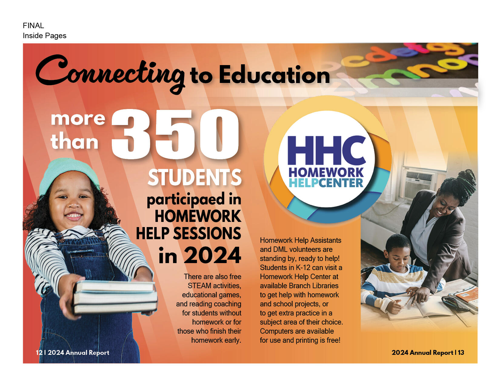
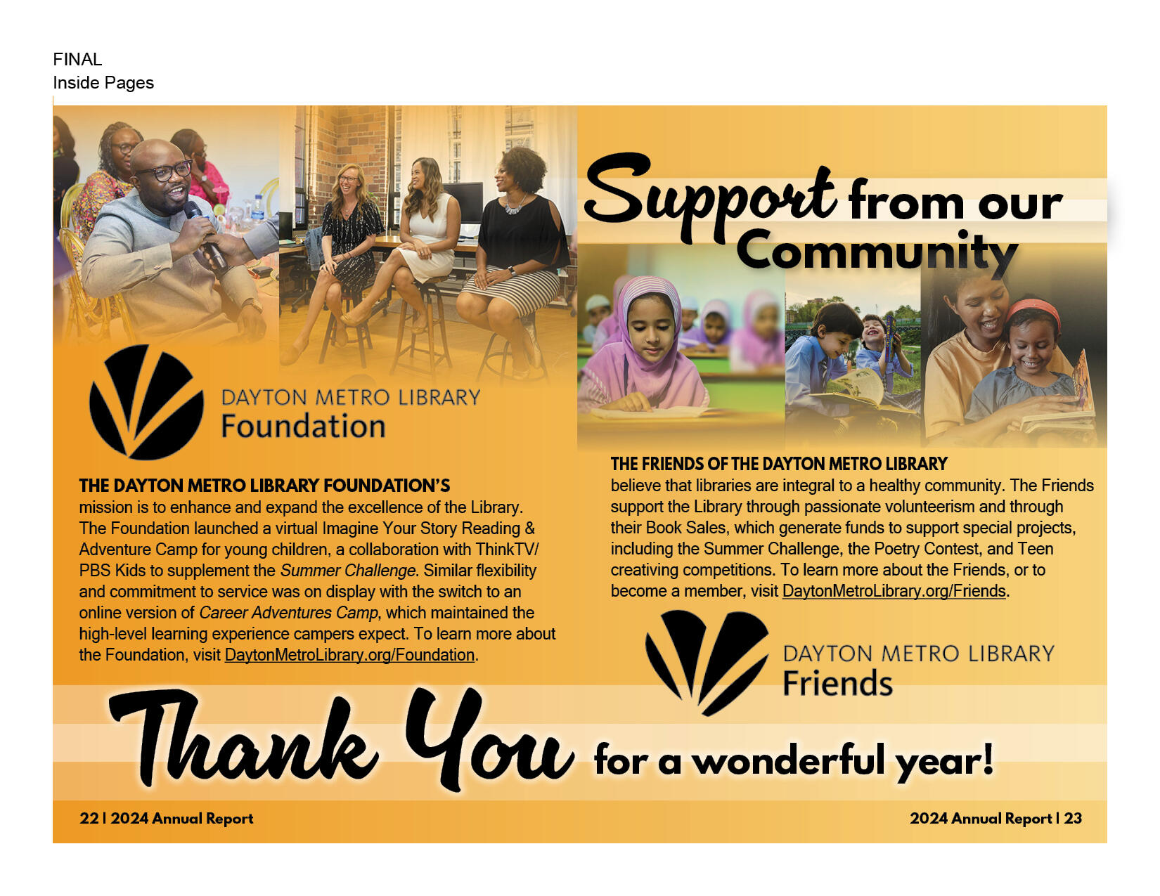
When researching the past annual report designs for the Dayton Metro Library, I found that inclusion and community development are very important. The imagery in the annual report designs reflect these elements and celebrate them. The designs favored overlapping geometric motifs with vibrant color and lots of photographic elements. The photos are a reflection of the diverse community served in the Dayton Metro Area and illustrate the impact that library services make.
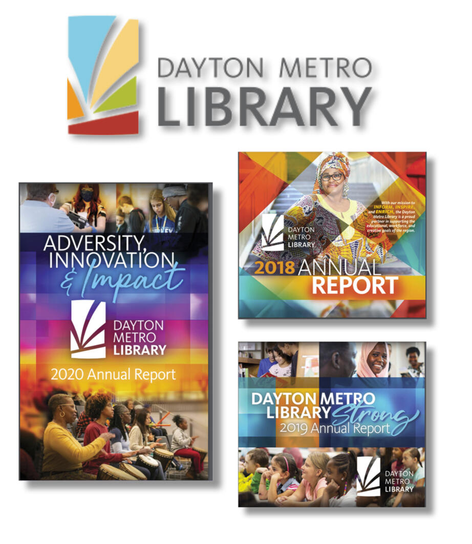
I wanted to continue with these themes with my design, but cut back a bit on the busy designs as at times the geometric patterns photos are overwhelming and make the information within take a back seat.
Sketches
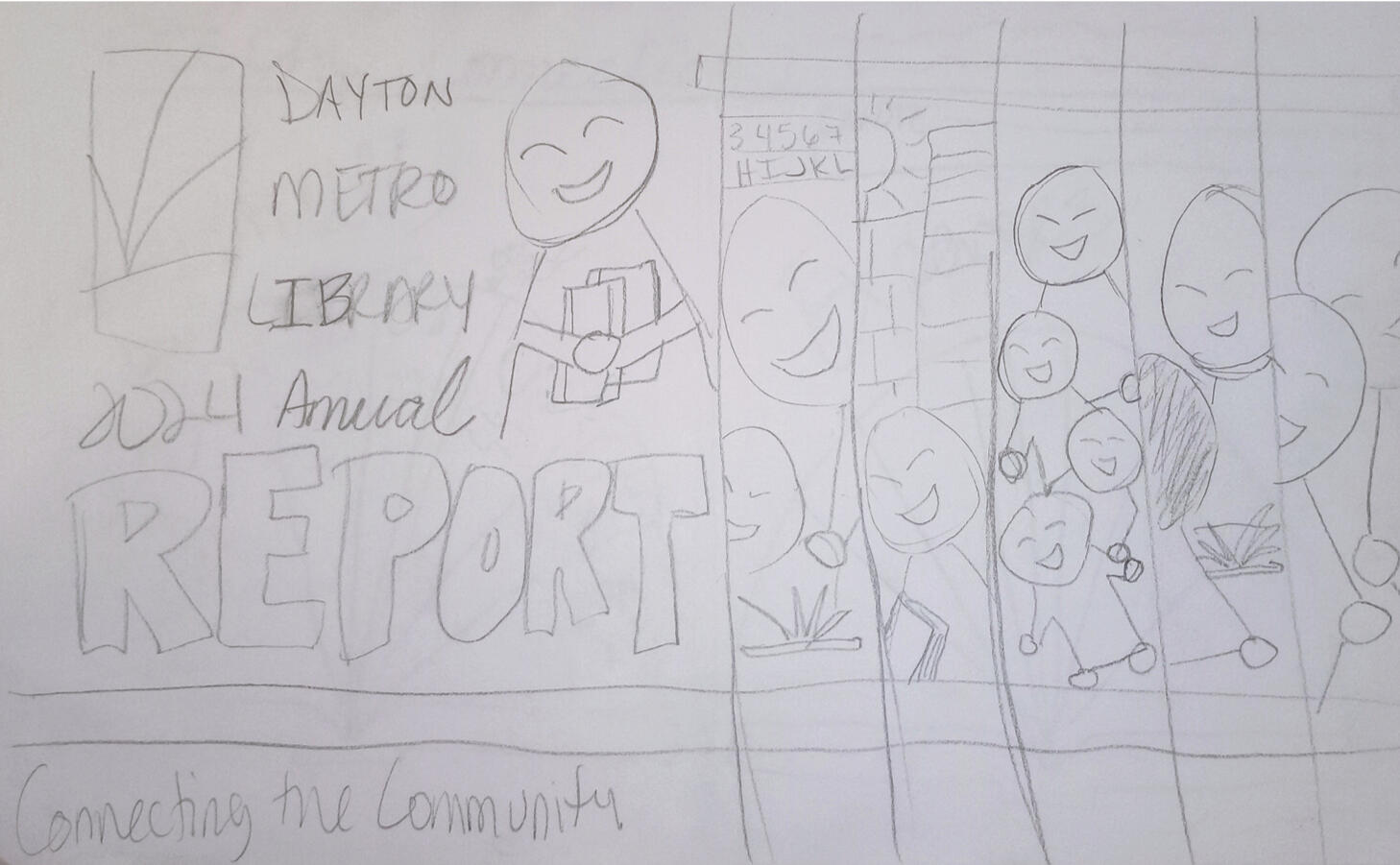
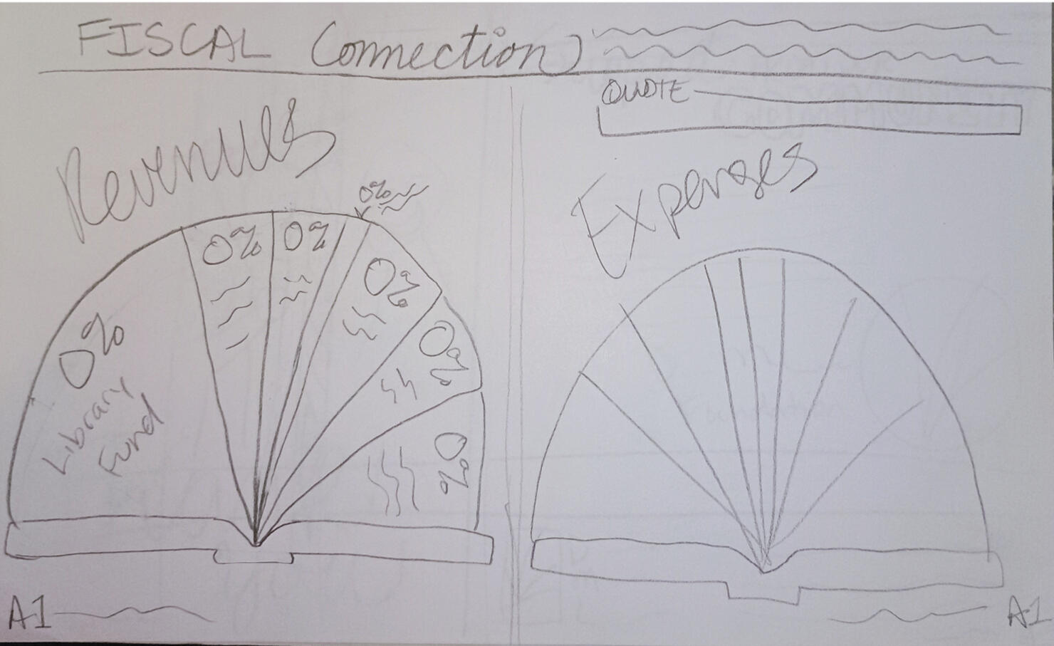
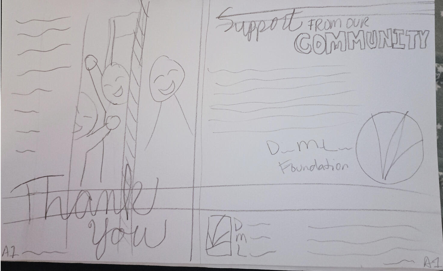
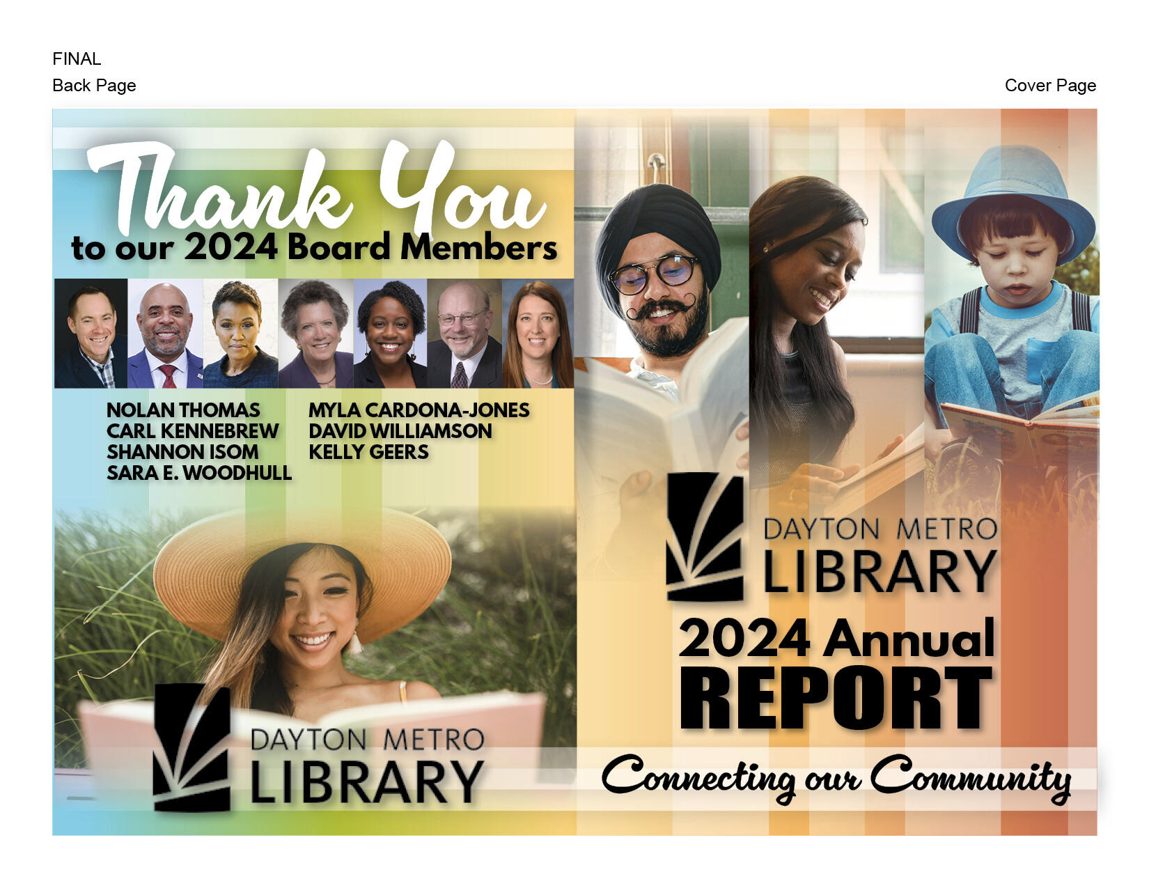
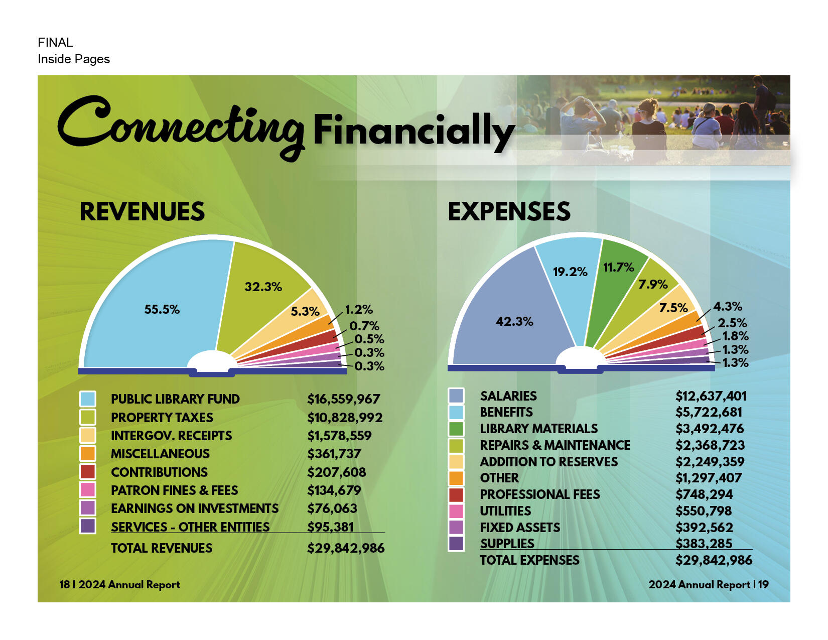
Each report had an overarching theme, and I chose “Connecting our Community” as mine since this theme will emphasize the importance of the relationship of the library system with the communities they serve. The relationship is a two-way street where the library supports community development in the workforce, education, and more while the community supports the library with donations and participation in programs. The color palate I chose reflects the colors of the DML logo. I also decided to use a vertical motif for the geometric elements to mimic books on a shelf. I continued this motif in the graphs for the finances appearing as open books.
Final Sample Spreads
Connect
© 2025 Joanna Mathews. All rights reserved.
